Your cart
Your cart is empty


For several years I have been sharing my life between my two passions, cycling and art.
I'm fascinated by the long distance and mountain cycling routes over the many renowned hills of the European countryside and I regularly take part in long distance events that are part of the Brevets de Randonneurs Mondiaux, like Paris-Brest-Paris, as well as endurance races across Europe like the Transcontinental Race. Over time, the world of cycling has totally blended with my original profession of graphic design and art direction.
My commitment to cycling extends beyond the sport, as I am currently the art director of 200 magazine and I create visual identities and collaborate with various brands and artisans, such as Café du Cycliste, Victoire Cycles, Distance Bike, Helmut Equipement, Classics Challenge and now Opinel.
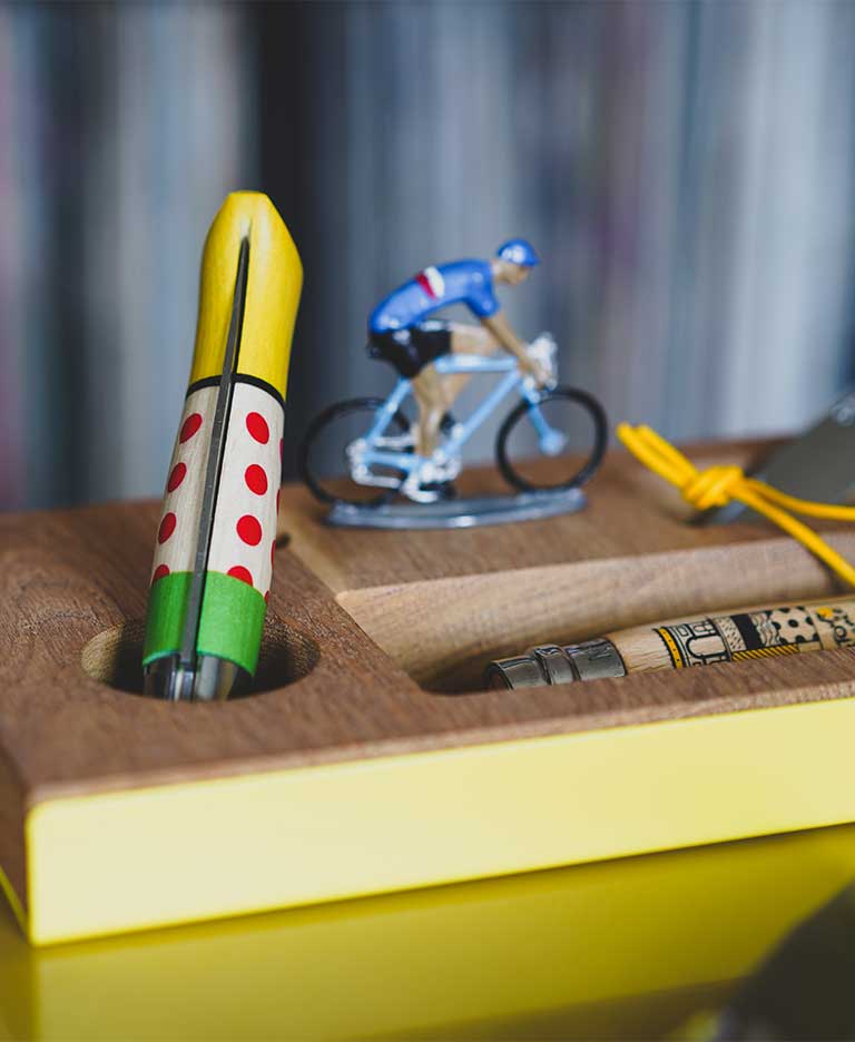
I was genuinely thrilled to be able to design these two Opinel n°8 knives as a tribute to the Tour du France.
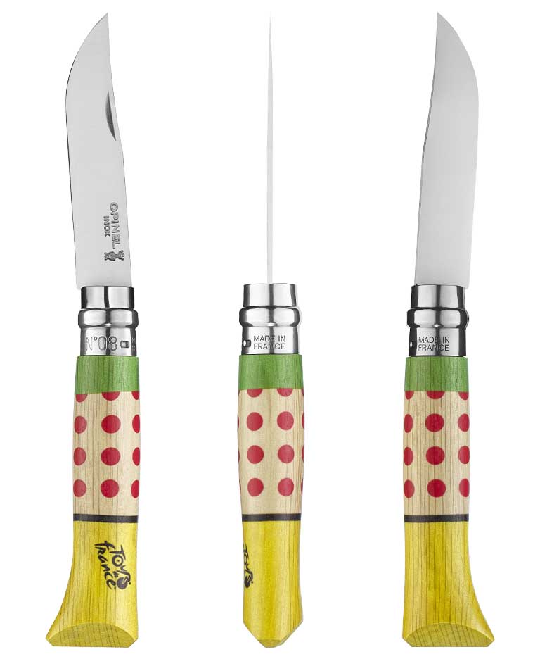
The overall look is based on strong graphic patterns, evoking the Tour. It felt good to come back to representing the Tour jerseys, just like in 2017, but with a new contemporary twist.
So, the overall colour code is based on the main Tour jerseys, with the distinction of the best climb, sprint, and of course the leader's yellow.
This graphic creation is free from any risk of uncertain representation, the result is a fun, playful object that speaks with easy-to-understand, statutory symbols.
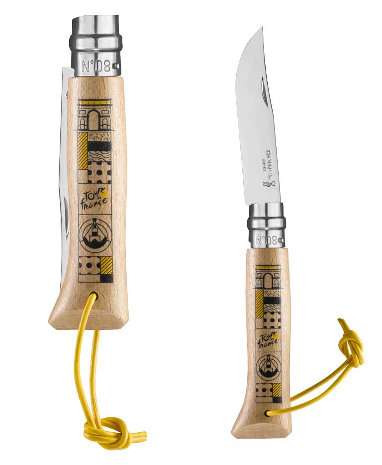
This creation brings in the notion of landscape, a geographical anchor with a wire treatment taking the form of symbols, topped by the Arc de Triomphe. The Mont Ventoux, symbolises the best climber while other images denote the elements: rain, water, mist.
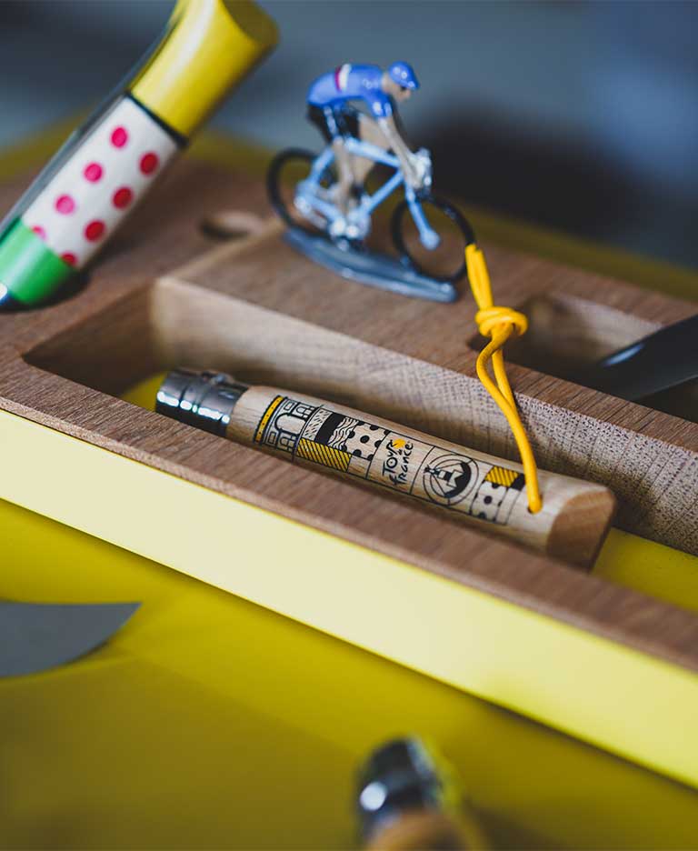
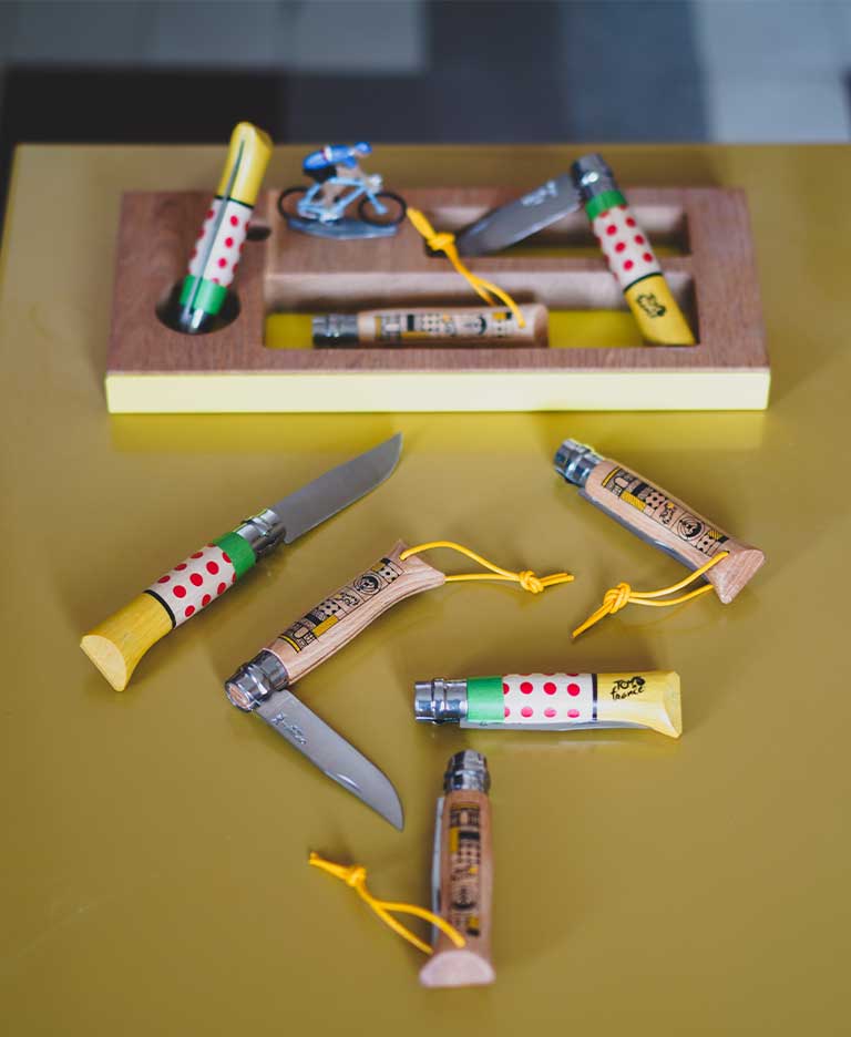
The idea was to create an object that tells a story, like a totem. A graphic design with a contemporary appeal.
My first memories of Opinel go back to my childhood. Family lunches by the sea with all the camping equipment, the image of my grandfather holding it, he used it for a lot of things.
Then, as a teenager, I went to my first summer camp in the high mountains and I remeber the feeling of pride at buying my first Opinel.
In my opinion, the values that Opinel conveys are simplicity, efficacy and tradition.
And in a way, because of its timelessness, its ability to be inscribed in a multitude of memories throughout a lifetime, it's a comforting object to own.
My previous work, which for the most part is anchored in the world of cycling, spoke for me really. My projects could be seen on the internet or in certain publications and Opinel noticed some of them and contacted me.
I was aware from the start of the emotions evoked by both Opinel and the Tour de France. I was so enthusiastic about this project, and keen to suggest different designs to represent the theme.
I was very satisfied with the whole process, which flowed beautifully and was very productive, with everyone involved bringing the skills they were so passionate about.
Timeless, effective, comforting.
Are you sure you want to perform this action?


